I’m very glad there is positive forward movement on redevelopment of the Oak Ridge Mall. However, I feel that the current layout proposed will fall far short of the ideal design, one that will best do what Oak Ridge wants it to.
I recently returned from my honeymoon through the Carolinas and Georgia, and along the way it dawned on me precisely what elements are in play regarding our gut “feelings” about downtown shopping, dining, and nightlife architecture—what makes one place more appealing than another.
Asheville, N.C.
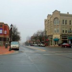
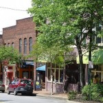
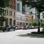
As my wife and I walked along the downtown in Asheville, we observed classic brick buildings, rarely the same in their window sizes, floor sizes, embellishments, or colors. We noticed the shops were rarely more than 20 feet wide, but were deep. We noticed trees and shrubbery along the sidewalk and that the sidewalks varied in width and style.
Columbia, S.C.
When we visited Columbia, S.C., we saw similar, but sometimes in a more urban setting. We noticed a liberal use of brick to break up the monotony of concrete and asphalt wherever possible.

Savannah, Ga.
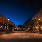
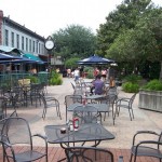
When we reached Savannah, Ga., we reached the holy grail of aesthetic comfort in Market Square. There was the same variety of brick styles, but dating further back in historical architectural styles.
In places, wooden structures even break up the stream of hard surfaces and sharp right angles. The distance between the two building fronts in Market Square varies from 30 feet upward. Where the space is wide, parks and “gathering places” exist in the center alongside satellite single story “blocks.” Where space is tighter, it is closed for all but pedestrian traffic. These aspects reminded me very much of both Faneuil Hall and Harvard Square in the Boston area, and of Knoxville’s own Market Square.
***
All these places felt “comfortable” to be in. They have character, and made me want to continue being there. They are relaxing and stimulating at the same time. Ultimately, what I discerned is that to create such a place three things are needed: diversity, proximity, and multi-story buildings.
Diversity
Diversity seems to be key in promoting a sense of character. Uniformity strips a view of its character. You NEED a change in architectural styles every 20 or 30 feet: the more significant the change, the better. Without such diversity, a place seems sterile, cold, and impersonal.
Proximity
You want as many storefronts as close together as possible, which is directly counter to the common design of wide storefronts. Aesthetically, though, from the outside, wide and shallow stores pale in comparison to the alternative.
In regard to building proximity, you ABSOLUTELY want the buildings as close together as possible. The modern mall concept of a big parking lot between buildings is completely counter to creating the right emotional response.
What you want, ideally, are storefront blocks separated by as little space as possible, around 30 feet apart, without vehicle access between them. Building proximity just feels “right.” The “spread them out” way of doing things has been a problem in Oak Ridge for a long time, and simply needs to stop if we want our town to be visually appealing. The long expanses between the various fast food joints and mini-malls along the Oak Ridge Turnpike illustrate this, and to a degree, so does our newest area of development along Illinois between Rutgers and Lafayette.
If you want people to window shop, you don’t want them to have to walk long distances across roads and parking lots between stores. When this happens, people stop at one place and then drive off, instead of staying and window-shopping. As a bonus, proximity makes a place seem more crowded, more “popular” than it is, like the difference between 20 people in a small apartment and 20 people in a gymnasium.
Multi-story buildings
I’m not sure why this feels right, but single-story blocks feel much less “warm” and “safe” than taller building blocks. The added bonus to creating buildings that have more than one floor is that we can move forward on the “mixed use building” concept knowing that not only is it an efficient use of the space, but also a more appealing one. Second-story apartments and offices in shopping districts usually rent for a high price, as well.
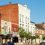
Counter example
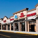
As an example, compare the image at left to the previous pictures. To me, this is too “cookie cutter” to be appealing, although they did attempt to vary the cornice design and alternate between painted surfaces and brick facades, and the storefronts aren’t very wide. But the single-story aspect of it seriously detracts from its appeal, as does the reuse of only two awning styles and one brick color.
Conclusion
If we’re going to move ahead with the mall, and other developments, let’s do it as “right” as possible. The insides of stores are designed meticulously to achieve a certain “feeling” from us.
Many of us homeowners have applied similar approaches with our yards and our homes, to great success. Those design patterns need to be applied to city planning as well. You simply cannot downplay the massive effect simple changes in layout and architecture can have in changing a location from looking “blah” to looking “wow,” from looking “cold” to looking “inviting.”
This new mall will be likely ours for decades, and although we can go in later to redo certain aspects of the design, we’ll find people warming up to our new mall MUCH faster if we just do it the best we can from the get-go.
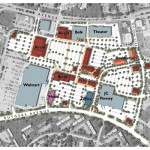
At left is the current overhead view for our new mall, as previously reported in the local news. The red-colored buildings will be the new ones built.
I’ve attempted to contact the developers, Crosland Southeast, to find out more specifics about the plan currently on the table, but they’ve not returned my calls. Therefore, I cannot speak with knowledge to the specifics currently in the design. My opinions for this new mall follow.
Make the new buildings two stories tall, at least, with a variety of embellishments (cornices, window sizes, etc) and core structural designs. Make the individual storefronts short instead of wide, to accommodate many smaller shops. As for materials, the city should impose a desire, at the very least, to use alternating brick colors.
In regard to the layout itself, the biggest fault seen above is the large central parking area between Belk and Walmart. It needs to be replaced with a park or another block of stores, or both. If a roadway is absolutely needed, make it a single lane, one-way loop with only drop-off and handicapped parking. All other parking should surround the mall area.
And the red-colored building just below the theater should be placed farther to the right so its left side aligns with the right side of the theater. This will allow the theater to be a direct part of the “center” area instead of excluded from it. Theaters generate crowds, and crowds of almost all sorts are good for a shopping area. Plus, a direct view from the front of the theater into the “center” area may encourage impulse shopping from theater patrons.
Altogether, these approaches will make the mall an immensely more visually pleasant place to be in, and will create for us an actual downtown square. It will make people want to stick around instead of “shop and go.” Whatever we end up doing, we’ll be better off than we have been for the past 10 years or more, but I truly feel we should aim as high as we can on this.
I hope this treaty finds welcoming ears in the members of our city government, and in the developers themselves, who are capable of achieving this higher goal.
Ray Evans says
Andrew
Good column. Having worked with Crosland Southeast over the past 10 months, I would say that they would agree with the vast majority of your thoughts and observations. Most of Crosland’s past projects have many of the elements that you describe as will this project.
I will attempt to answer a few of your questions.
You mentioned in a previous post that we were buying a mall. Crosland is purchasing the property, demolishing the mall and constructing a muti-use town center with retail office, hotel and residential elements.
The current site plan is about version 60. I have seen over a dozen different version over the past several months. What I have learned is that this is a buyers market not a sellers market. A few year ago retailers were building 75-100 new store a year. Now that number is down to 15-20. Competition for these retailers is much stronger than before. They get to select the deals that they want to do and on their terms. Therefore the retailers drive the site plan. The current version is very reflective of that fact.
In the current plan, the retail area between the office and the theater is that place making element of which you spoke. Wide sidewalks, on street parking, well landscaped, small shops, outdoor dinning, etc. That element’s location relative to the theater is mostly dictated by the theater itself. Cinemark has deed requirements granted to them that a certain number of parking spaces be made available to them directly in front of the theater during certain seasons of the year. It’s my understanding that Cinemark is happy with the current plan.
One thing that I’ve learned to respect about Crosland is their due diligence. They are very thorough. I am not aware of any failed investments. They do their homework before they move ahead.
I would be happy to discuss any of this with you in more detail at you convenience.
Pat Fain says
Andy, I totally agree with your observations and conclusions. I have long felt that form-based zoning that stresses repetition of design is singularly aesthetically unappealing. I too am hopeful that Crosland has this belief and practice. Certainly their reputation seems to indicate this. Many people respond positively to the elements you have described; few are able to do what you just did in combining description with analysis to explain why it works that way. Thanks for the wonderful analysis. Pat Fain
Andrew Howe says
The town centers on Crosland’s web site certainly do look good. I agree that they’ll build something appealing – more appealing than Turkey Creek from what I’ve seen, too.
They might be able to work with Cinemark to renegotiate that parking stipulation – we’re talking about moving a building only about 50 to 75 feet. Parking could still be on the Turnpike side of that building, right in front of the theater (as it is above), and on the ‘town square’ side (if they keep that area as parking instead of a grassy stretch), allowing for just as easy theater access. Not a huge deal either way. I just like old school concept of the theater being a central focus of the “attraction.”
Thanks for responding Ray. When y’all get to a tipping point where a design is fairly stabilized and certain percentage of the new mall stores have signed on to rent space, get us some conceptual drawings, data, etc. We’re all really excited and curious!
Only one question left. What’s the contingency plan if this venture doesn’t thrive? Will that area be locked-up until it can be paid off ? If it fails, the tax revenue won’t be as rich as a successful venture, so the TIF won’t be really working as we want it to in this case. I’m sure we could go through the whole cycle again in a worst-case scenario, but I’d think a fail-safe would be in place considering the past 15 years experience.
Tracy Walter says
The above is how Jackson Square should be developed. Not the mall area.
Andrew Howe says
I agree partially. I think Jackson Sq and Groove Center should retain the same look and feel of the original 1943 designs, to help accent our history.
but in regards to the proposal Jackson Sq District, I think brick, two story, multi-use buildings should be erected. Which is what Mark Watson told me was the general idea in mind – although not specifically brick.
Brick is more costly than other forms of construction, which is why you see it used less today than in the past.